Background
1 in 5 U.S. adults experience mental illness each year (NAMI 2023)
I started this project because I believe there are not enough resources for mental health services as there should be. I thought that I could design a better option for individuals to find help.
Mental health affects everybody with a brain. It is crucial to provide multiple avenues to service mental health needs.
Timeline
Weeks 1-3: Primary & Secondary Research, Ideate & Design
Weeks 4-6: Test & Iterate
My Role
UX Research
UX Design
Problem
The problem I focused on here was to ease the access and affordability of getting mental health aid.
EmpowerMENT is a mental health app that helps struggling individuals find community, and educates those on common mental health disorders, myths and tips.
The goal of this app was to create yet another option to provide mental health services. I am dedicated to normalizing the idea that one’s mental health is as important as one’s physical health.
Tools
Figma
Miro
Milanote

The process…
1
2
3
4
5
Research
“46% of Americans with an unmet need for mental health services did not receive services because they couldn’t afford it,” (SAMHSA 2022)
Market & Competitive Research
47% of millennials have a depression diagnosis (SAMHSA 2022)
45% of millennials get their daily information from social media
BetterHelp, TalkSpace and Psychology.com can link you with a therapist, but which many cannot afford.
Calm app focuses on grounding and meditation, but it is also important to connect with others for mental healing
Psychology.com had articles about mental health issues written by actual doctors.
Define
During this stage, I surveyed and interviewed potential users, and then synthesized the primary and secondary research I collected to better understand and define my users.
Screenshot of my screening survey
Synthesizing the Results
3/3 interviewees said they found most of their mental health information from social media
3/3 interviewees mentioned that the prospect of looking for mental health services is daunting and discouraging
2/3 interviewees preferred in-person therapy to online therapy
2/3 interviewees were insured through their state and had significant struggles in finding mental health services they could afford
2/3 interviewees mentioned limited availability of therapists/help due to physical location
0/3 interviewees liked the idea of integrating AI into a type of mental health service, because it’s disconnecting to talk to a bot.
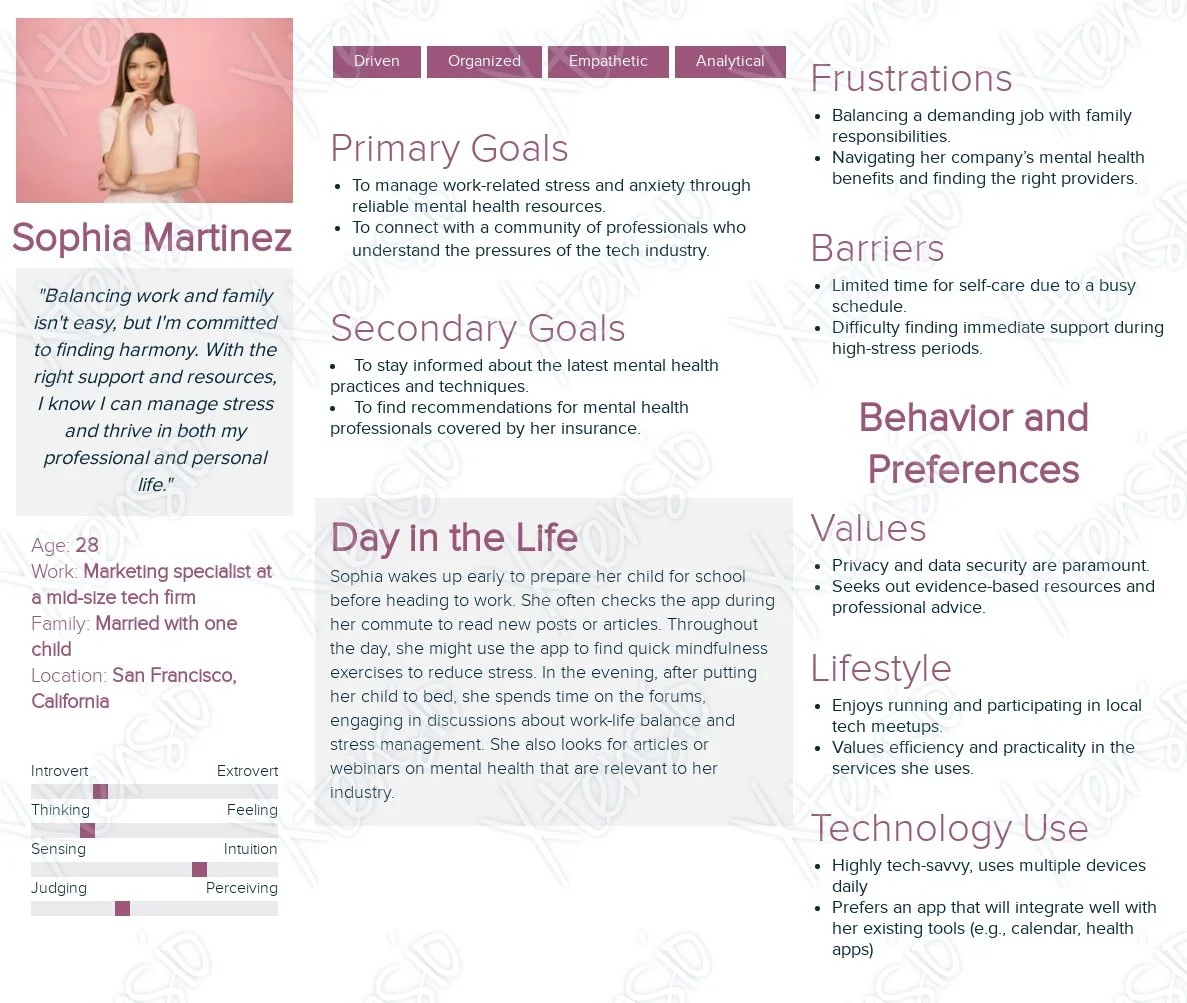
The participants I interviewed fell into one of two categories: Insured and Un-insured/State-insured. I created two personas based on these categories as a way to empathize more with my prospective users.
Interviews
I surveyed 30 individuals about their mental health and habits for finding mental health info.
I then outreached 3 of those individuals who suffered the most from this problem and interviewed them for further information.
Sample Interview Questions
How would you describe your experience with finding mental health services or aid?
How do you typically learn about mental health information?
Do you have a preference for in-person, online/mobile, or hybridized mental health aid?
How do you feel about integrating AI into mental health, such as a personal assistant?
“"I'm currently working 2 part time jobs which neither have benefits, so I’m going to have to look at paying out of pocket for insurance"
-Participant Quote
Who am I designing for?
Affinity Map in Miro
To try and create solutions for how we might address user’s frustrations, I created the following HMW statements:
How might we create a community driven experience in an app?
How might we utilize social media as a way to provide succinct and factual information about mental health?
How might we prevent financial obstacles from getting in the way of users in need of help?
How might we ease access to mental healthcare?
Design
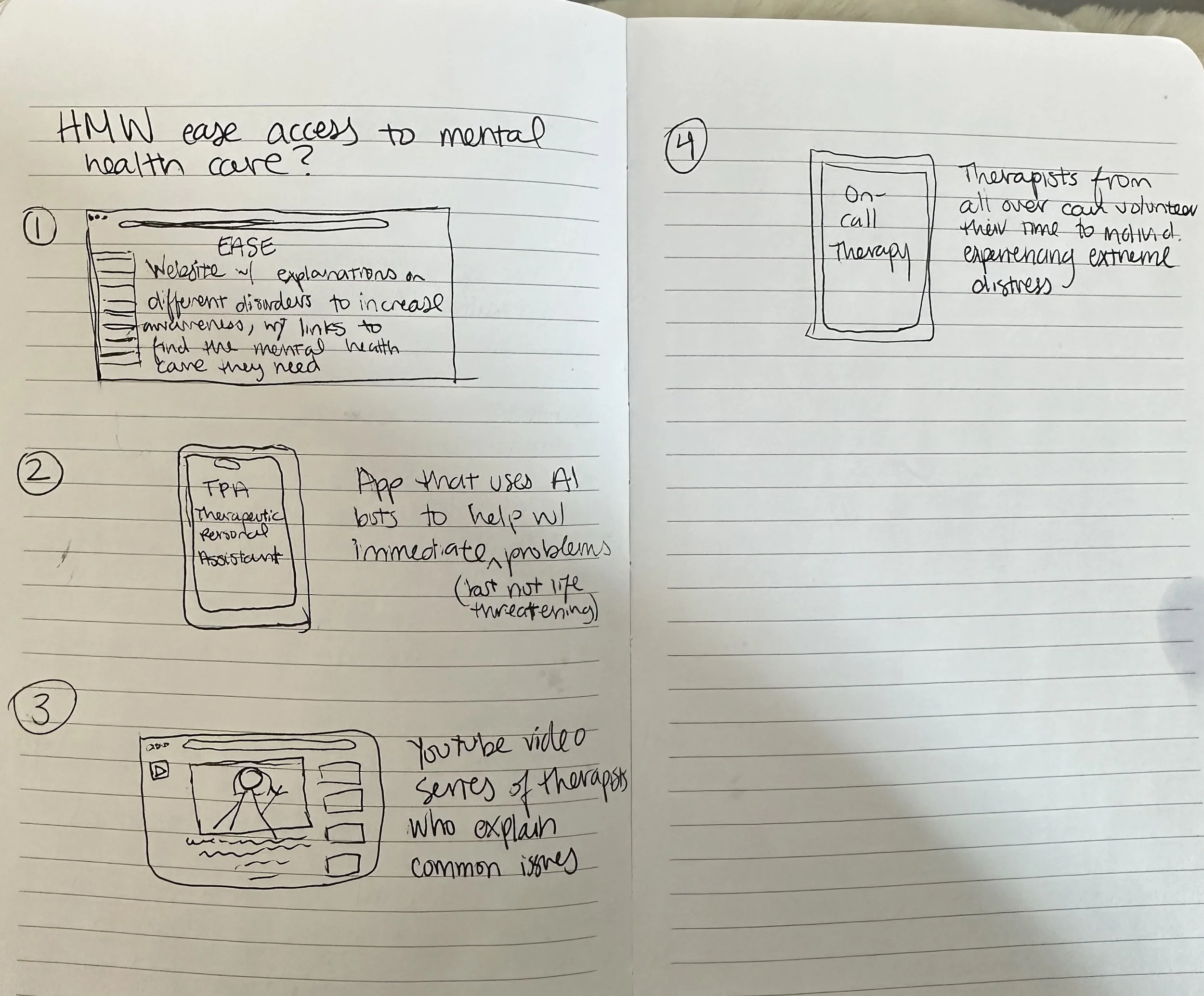
To kick off the design stage of this project, I started sketching different solutions to address the user needs and my How Might We questions I identified in the Define stage.
Initially, I had the idea for a website that had a personal AI feature with informative articles about mental health. After learning from my interviews that AI was unpreferred, I thought about designing a mental health community website with forums to connect, and a learning feature where doctors could write informative articles.
I sketched this out as a potential website design, but later realized that a website isn’t as accessible as a mobile app. I incorporated this idea once I got to my wireframing stage.
Low-Fidelity Wireframes
I created lo-fi wireframes to play with the layout of my app. I ended up re-visiting this part of the process multiple times, as the layout of my app changed with each stage. The following are the final wireframes I decided to work off of.
Fig. A: Early Ideations Stage
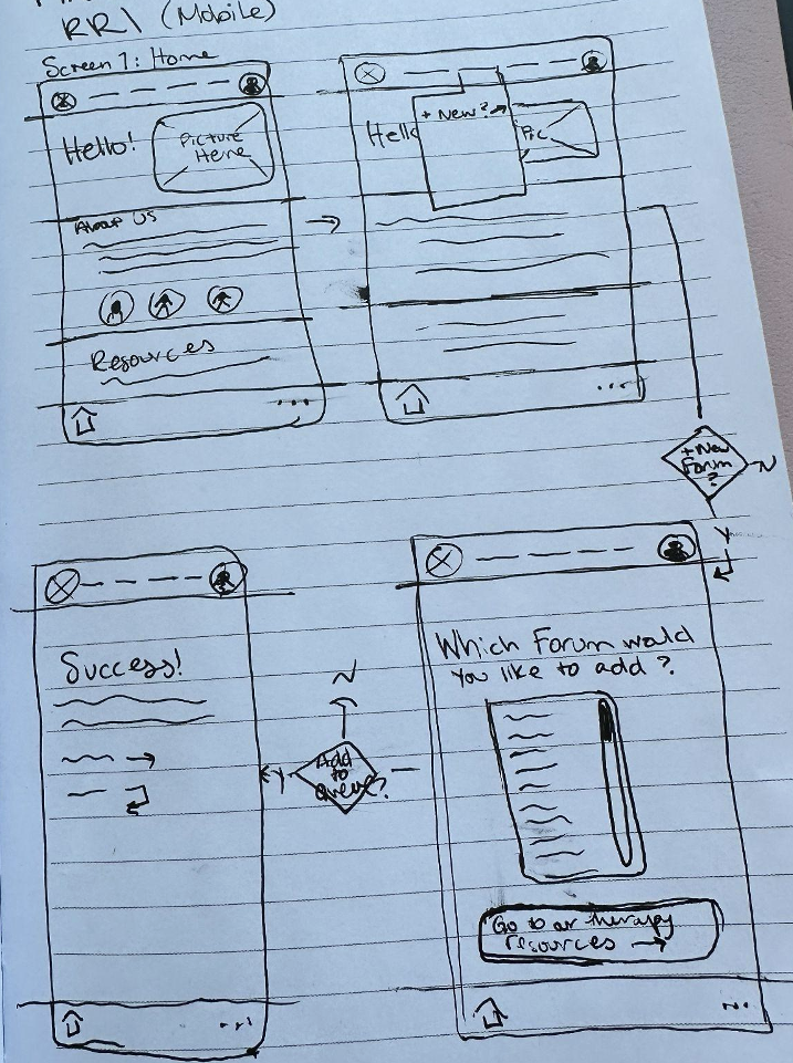
Fig. B: Early sketch of first Red Route
I created the hi-fi wireframes using the style guide I created.
This stage was where I learned the most about color theory, layouts, visual hierarchy and typography.
Fig. C: Early sketch of second Red Route
User Stories & MVPs
I created MVPs from User Stories that helped me focus on the most important information that came from my research, and make sure user’s needs weren’t getting lost in the weeds.
I chose these specific MVPs because users consistently said that affordability, accessibility, and community were most important to them when looking for mental health help. I then used the MVPs to help me create a primitive sitemap for my app, testing out how the general navigation might go.
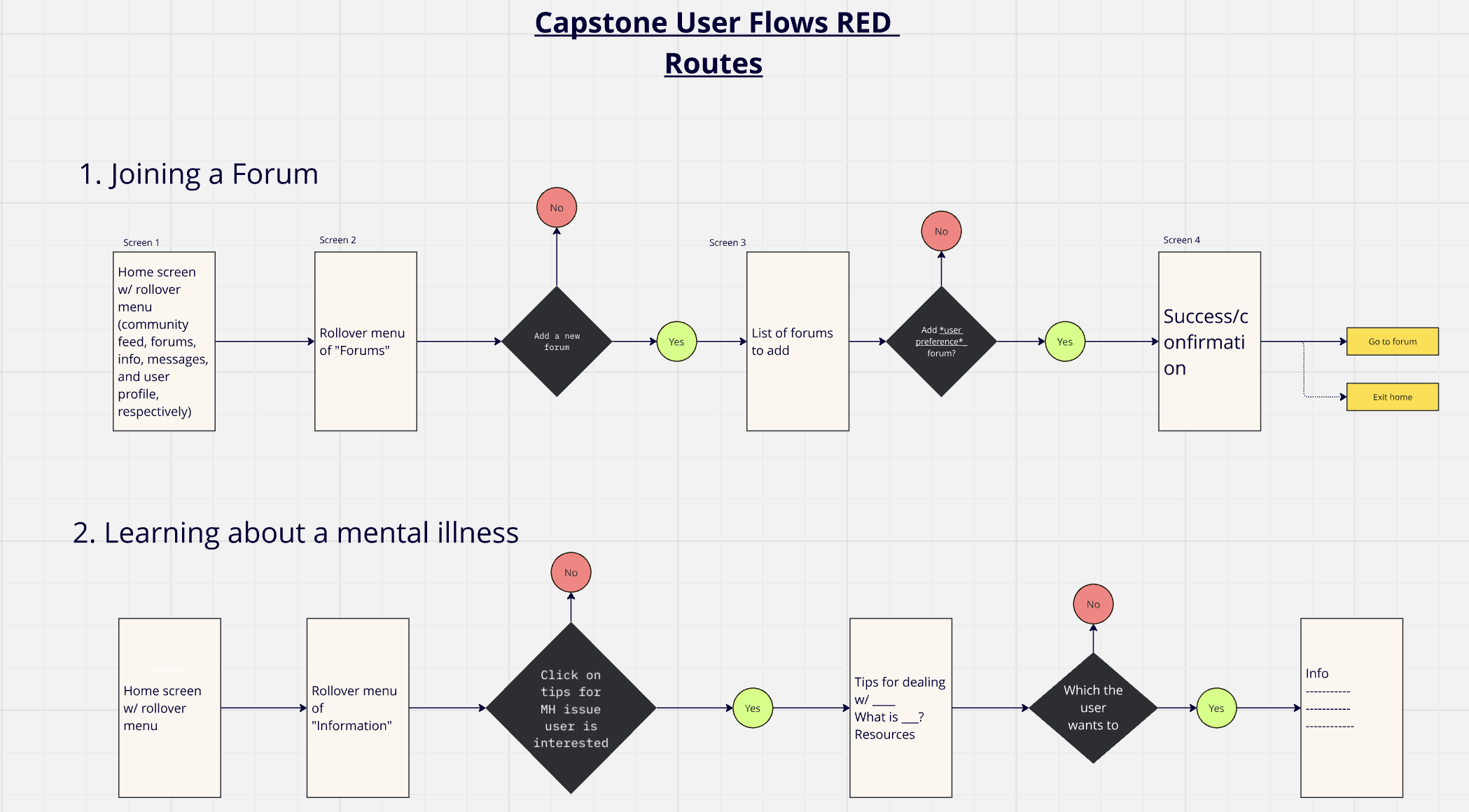
Red Route User Flows
Note: Given that this was my first design project, the initial sketches, flows and framework reflect an early stage of development and exploration. Most of the early commissions I did on this project changed over the course of me learning new design techniques.
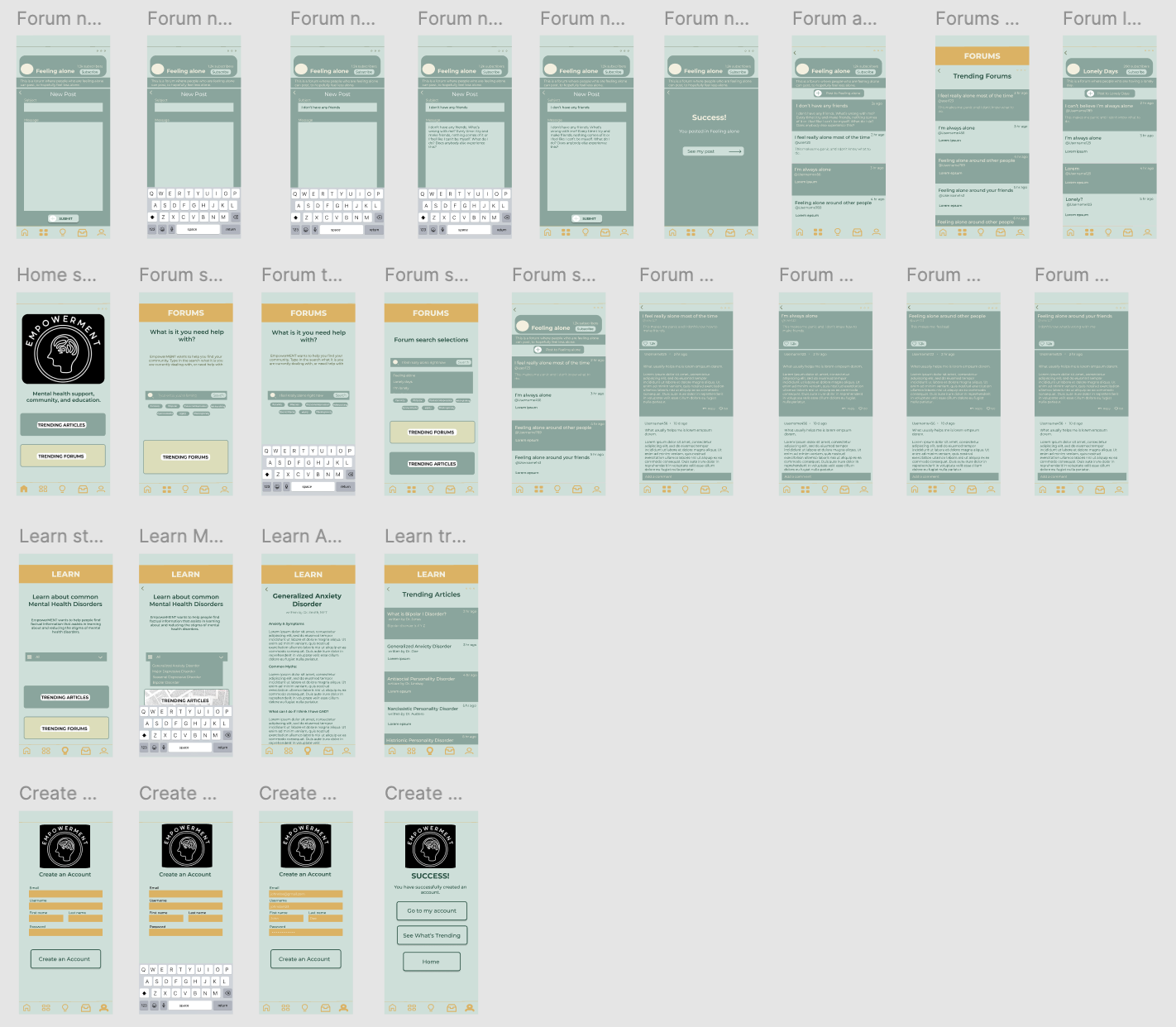
High-Fidelity Wireframes
This stage was where I learned the most about interaction design and how to incorporate those principles into your product.
Through feedback from my advisor, I implemented:
Better readability
Universal icons
Better discoverability
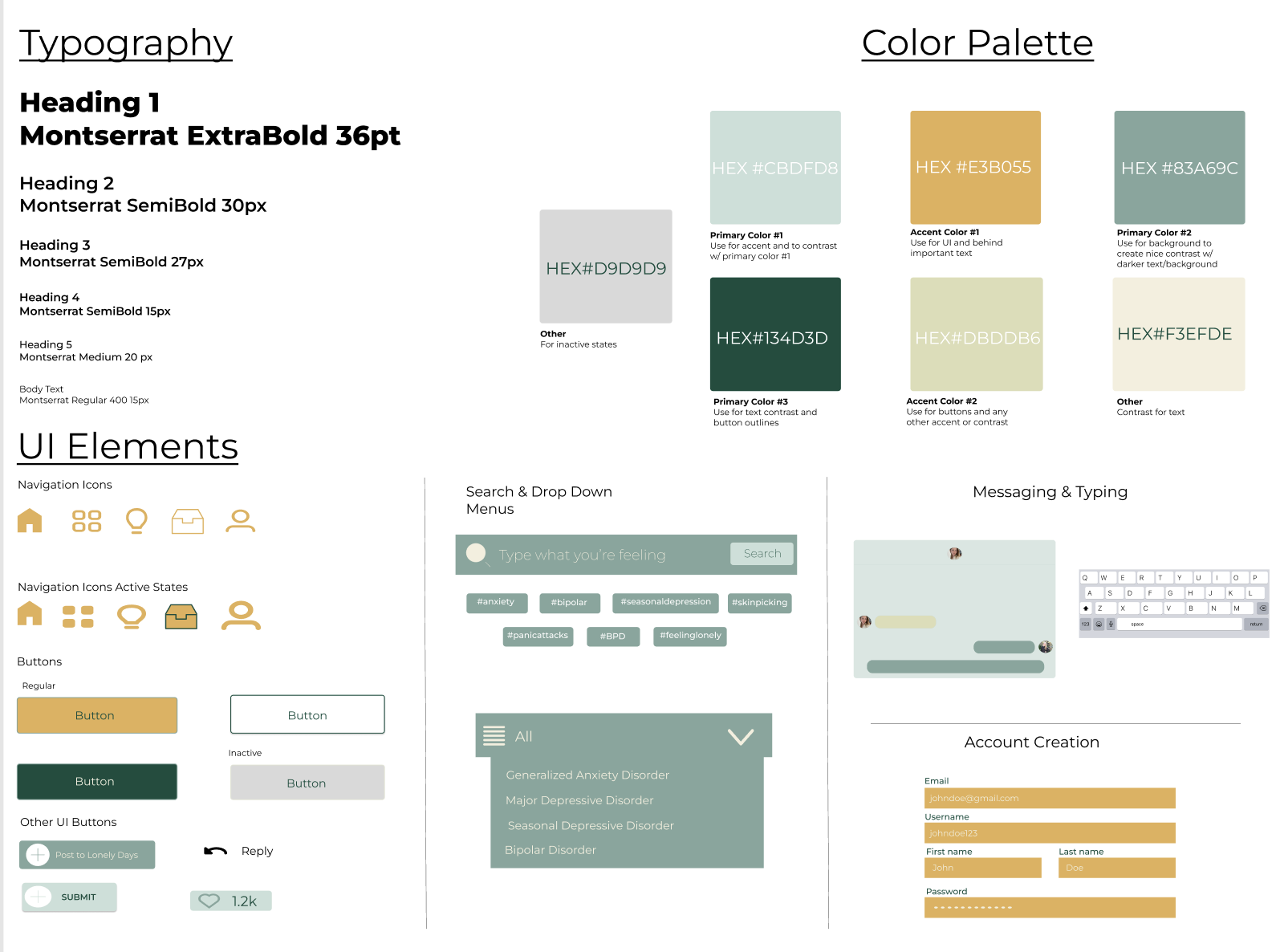
Mood Board & Style Guide
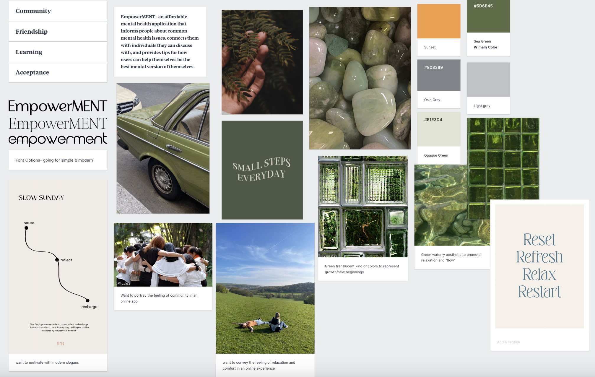
The mood board was a way for me to play around with how I wanted the app to feel, look, and base its aesthetics off of.
The style guide was a way for me to organize the creativity from my mood board into a real “map” of my product. This is the ultimate style guide I made, but it went through a lot of changes to get to this final look.
I wanted my app to convey the feeling of welcoming, warm, and minimalist/modern, which is why I chose an easy to read layout, utilizing:
Color
Green - growth
Blue - calmness and trust
Yellow - confidence and hope
Orange - optimism and connection.
Size
Typography sizing is proportional and follows natural eye movement patterns
Spacing
Test
Prototyping
I created a high-fidelity, semi-fully-functional* prototype of the red routes of my product using Figma. During this time, I also started recruiting participants who would be willing to try my application for usability testing.
The following video is an example of a user going through the Forum red route flow; the clickable prototype is located in Figma.
*Semi-fully-functional only because certain interaction elements, i.e. typing/searching, are not available in my version of Figma.
First Round Major Issues:
Issue #1: Users thought navigation icons were unclear
I went back to do a little research on universal icons and selected icons that looked more common.
Issue #2: UI was too bland and text-heavy
I revisited my course curriculum on visual hierarchy and typography, and fixed the color scheme to feel less sterile
Issue #3: Certain interaction elements were faulty
I had to go back and fix certain interaction issues; the scrolling element I had on one screen did not work, and the “like” interaction button was coded wrong.
Usability Testing
Issue #1: There shouldn’t be an option to “dislike” a post
A user suggested that, for a mental health app, there shouldn’t be a like and dislike button, but rather a heart or only a thumbs up to encourage good spirit.
Feedback #2
The buttons should have fancier animated feedback so users feel more inclined to press the buttons
Issue #2: Have trending, clickable items
Another user suggested that I should have different trending items pages, along with suggested hashtags so users don’t have to think up something to search.
Feedback #3
Navigation icons should be a little bit bigger to ease possible frustration of tapping on the wrong thing
I did two rounds of usability testing. In the first round, I tested 5 participants, and asked them a series of questions about the overall look & general first impressions of the design, and then instructed them to perform a series of tasks. My participants were able to complete the tasks required of them, but had some feedback that ended up being crucial. The issues and iterations are outlined to the left & below:
First Round Notable Suggestions:
For the second round, I tested 3 more participants with the fixed prototype. These participants went through the prototype with a little more ease, and only had minor feedback about design elements.
Feedback #1
The buttons for the trending articles and forums are too difficult to read with the background photos
Learning & Next Steps
The journey of this project has been both challenging and enjoyable, and provided me the opportunity of fostering both personal and professional growth.
This project pushed me to develop my skills as a designer and feel more confident in my creative abilities.
Per my limited design background, I’ve learned to embrace it’s iterative nature, and accept that perfection is an evolving target, and imperfection is a natural and valuable part of any creative endeavour.
I hope that this project sparks a change in how we view mental health, and how we provide those in need with care.
